NM Cannabis Sales Data | Google Sheets, Google BigQuery, SQL, Tableau
The inspiration for this analysis comes from my background as a journalist working on the border of Texas and New Mexico.
When the recreational sale of cannabis began on April 1, 2022 I was in the newsroom – sending out crews, researching dispensaries, and putting together a show for broadcast. Since then – I’ve kept a close eye on the sales figures out of the Land of Enchantment.
TLDR
New Mexican cities along the borders with neighboring states tend to have a disproportionate number of sales (largely recreational) compared to similarly sized areas further into the state.
Analysis
To begin, I sourced the data from the New Mexico Cannabis Control Division’s press releases. These came in the form of PDFs as well as a singular webpage.
The tools used in this analysis are Google BigQuery, Google Sheets, and Tableau.
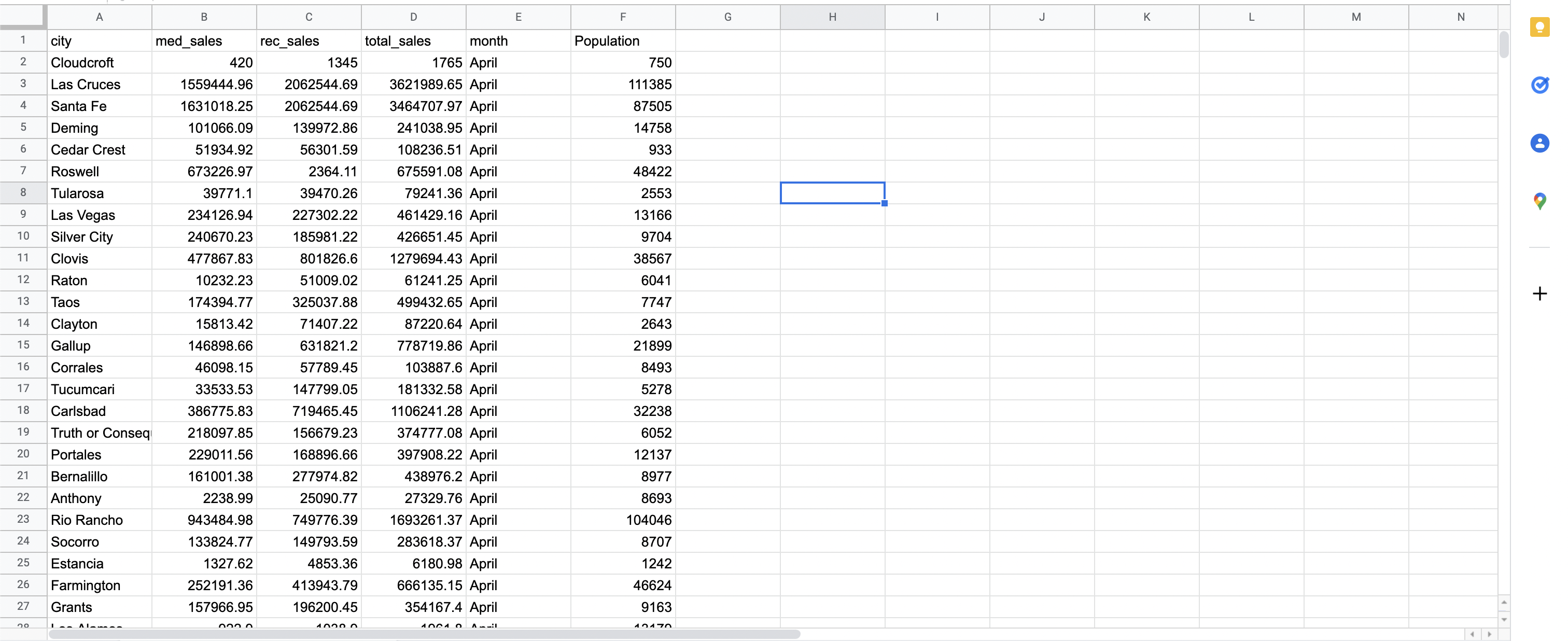
To begin, I created a Table to house all of my sales data.
CREATE TABLE nm-cannabis.NM_CANNABIS_SALES_22.nm_cannabis_sales_2022 (
  city string,
  med_sales float64,
  rec_sales float64,
  total_sales float64,
  month string
  );
I then went about manually inputting the sales data into the table.
INSERT NM_CANNABIS_SALES_22.nm_cannabis_sales_2022
  (city, med_sales, rec_sales, total_sales, month)
  VALUES ('Albuquerque', 6858325.86, 8003406.40, 14861732.26, 'April' )
I then downloaded a dataset consisting of population figures from the 2020 U.S. Census. This was an exhaustive list of cities and Census Designated Places (far too much for our needs), so I formed the query below which creates a new table for editing and contains only the cities being utilized in the analysis. The Census dataset was also VERY wide, so I unpivoted the data narrowing the number of columns from the dozens to just three.
CREATE TABLE NM_CANNABIS_SALES_22.nm_cannabis_population
AS SELECT _Label__Grouping__ AS Category, Population, City
FROM 'nm-cannabis.NM_CANNABIS_SALES_22.nm_population_2020_censius
        Albuquerque_city__New_Mexico,
        Las_Cruces_city__New_Mexico,
        Santa_Fe_city__New_Mexico,
        ....etc.
FROM `nm-cannabis.NM_CANNABIS_SALES_22.nm_population_2020_census`

UNPIVOT (Population FOR City IN (
        Albuquerque_city__New_Mexico,
        Las_Cruces_city__New_Mexico,
        Santa_Fe_city__New_Mexico,
        ... etc.
;
I then joined together the two tables I created using the query below,
SELECT sales.city, sales.med_sales, sales.rec_sales, sales.total_sales, sales.month, pop.Population
FROM `nm-cannabis.NM_CANNABIS_SALES_22.nm_cannabis_sales_2022`sales
LEFT JOIN `nm-cannabis.NM_CANNABIS_SALES_22.nm_cannabis_population` pop
ON sales.city = pop.City
WHERE pop.Category = 'Total_Population';
The last line of the query refers to a specific category of population, the Census data had all population data split by demographics but for the purposes of this analysis they were largely unnecessary.
After the tables were joined I exported the .CSV to Google Sheets. One of the beneifts of using BigQuery is that datasets can be linked to individual sheets making it easy to query data already existing within a database on the Google platform. I chose to keep everything separate for the purposes of this analysis.
Next, I created a pivot table. There I created two new values, Pop Difference and Sales Difference.
Pop Difference (Dividing Total Sales by Population):
=ARRAYFORMULA(D2:D53/E2:E53)
Sales Difference (Dividing Recreational Sales by Medical Sales):
=ARRAYFORMULA(C2:C53/B2:B53)
My hypothesis going into the analysis was that cities close to the state line will have disproportionately higher sales figures compared to similarly sized cities further into the state and that they will have considerably higher rates of recreational sales figures compared to medical sales. That was proven fairly accurate. I also fitlered for month in my pivot table, taking only the data from the most recent month. I originally wanted to take the average of the sales data for the past five months, but some areas had drastic outliers that would have skewed the data. I also floated the idea of taking the median of the sales data but decided it would be best just to use the most recent, up-to-date monthly data instead. An average change would be useful (I think) if I was doing a seasonal analysis for example, but for the purpose of this analysis it wasn’t entirely necessary.
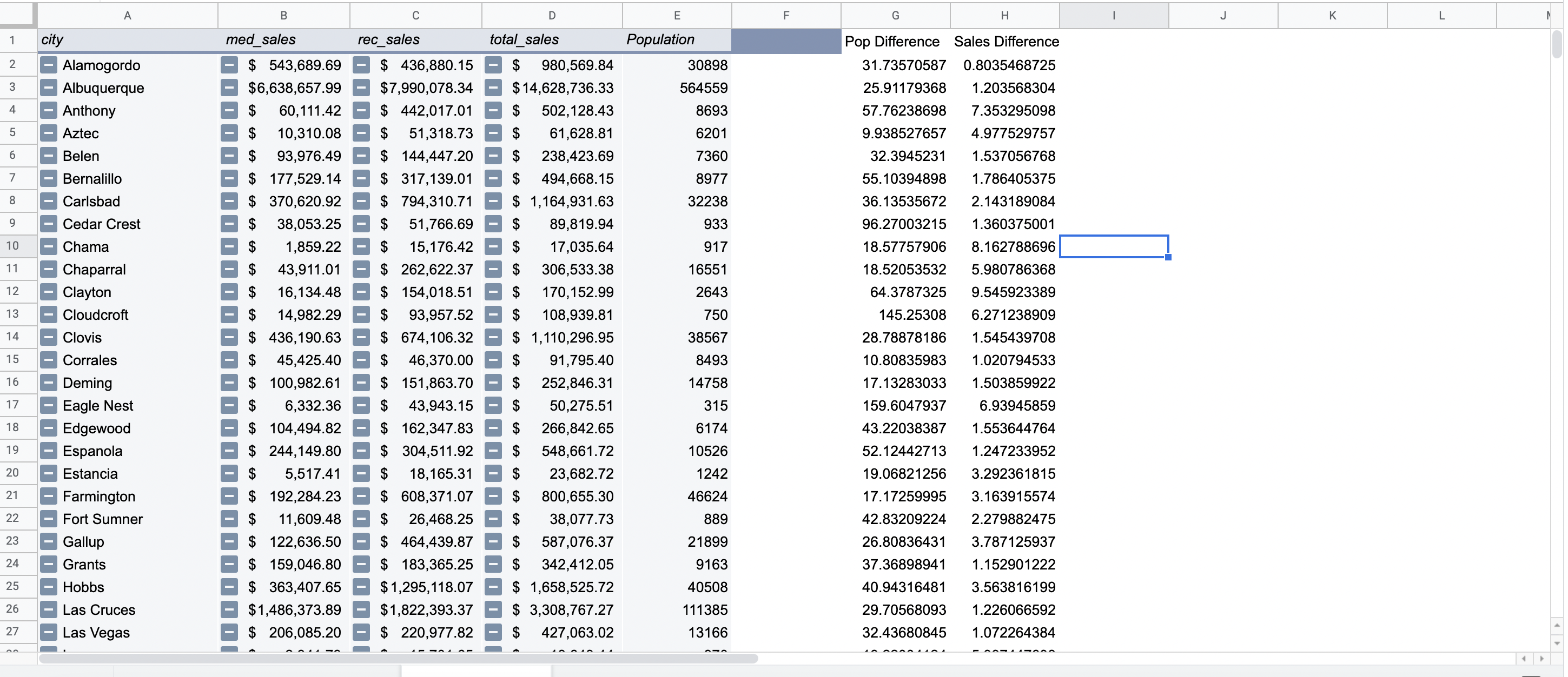
From the pivot table we can tell that towns on the state line have disproportionately larger sales figures than their population. Looking at the Pop Difference values, in Albuquerque (a town of 564,559 people) if it was only locals buying cannabis, on average, each person from Albuqerque would have to spend $25.91 on cannabis per month to match total sales figures. While in Sunland Park (a town of 16,702 people on the border of Texas and New Mexico) if it was only local buyers, each person from Sunland Park would have to spend $91.44 per month on cannabis to match total sales figures.
Now, in all likelihood, Sunland Park probably isn’t so filled with pot-heads that each person in town is spending a week’s groceries on cannabis. One explanation for this is Sunland Park’s proximity to Texas.
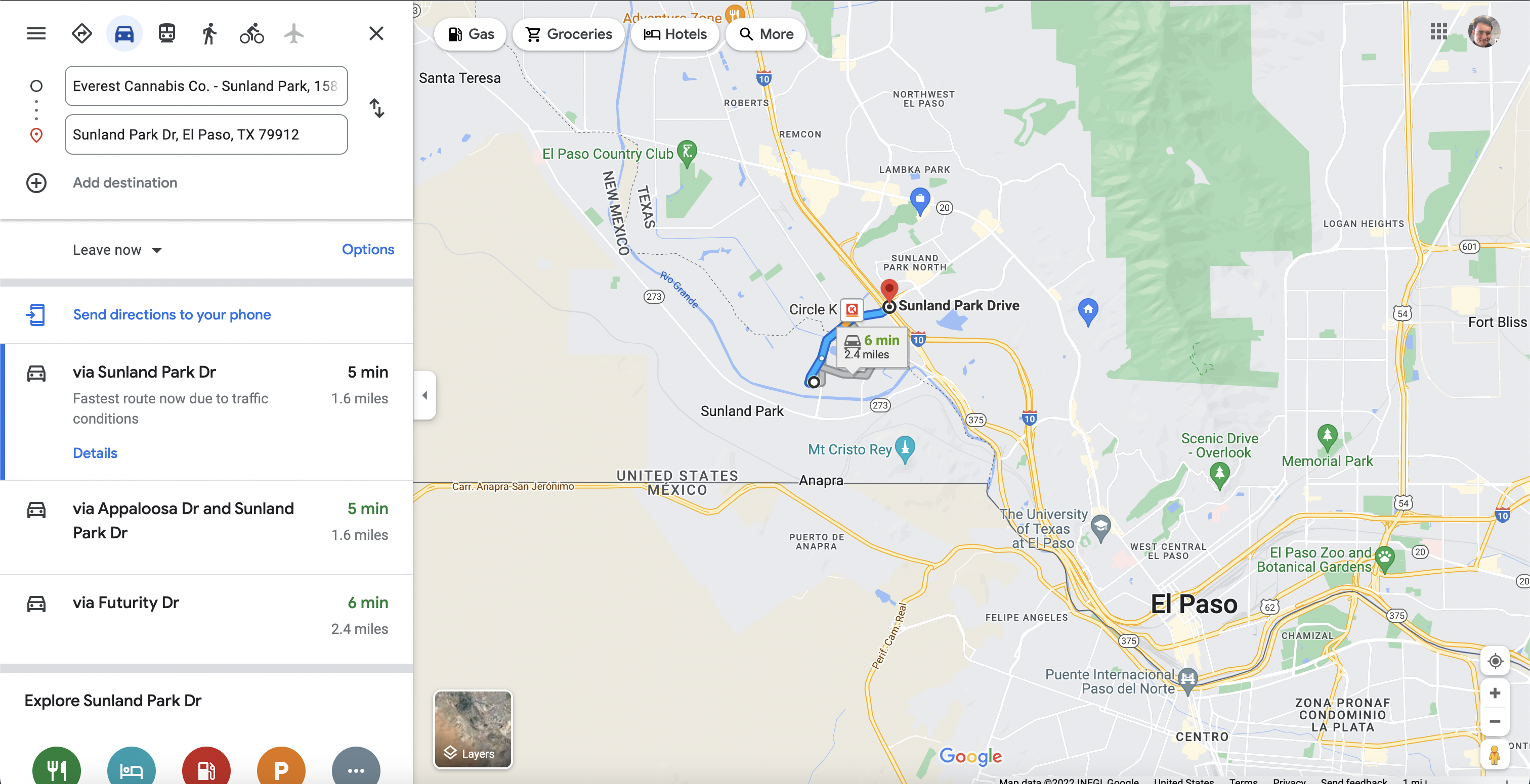
It’s only a five minute drive from the interstate at Sunland Park in El Paso, to the nearest dispensary in Sunland Park, New Mexico. As Texas hasn’t legalized recreational marijuana many Texans are now crossing state lines. This is well documented in local El Paso media, including this article.
In which the publication El Paso Matters reports that on the day recreational use was legalized, nearly everyone waiting in line in Sunland Park, New Mexico – were from El Paso, TX.
Visualization
I then created the dashboard below using Tableau. I plotted the cities on a map of New Mexico, creating one map highlighting the difference between total sales and population figures. The second highlighting cities which saw more recreational sales than medical sales. Then I created a table in the bottom right that that also contained these figures.

One of the things we notice in our first chart, is that there tends to be a clustering of larger circles in the center of the state (namely the Albuqerque area and the Santa Fe/Taos area). The other large circles we see are along the border with Texas (Tutumcari,Texico, Tatum and Sunland Park).
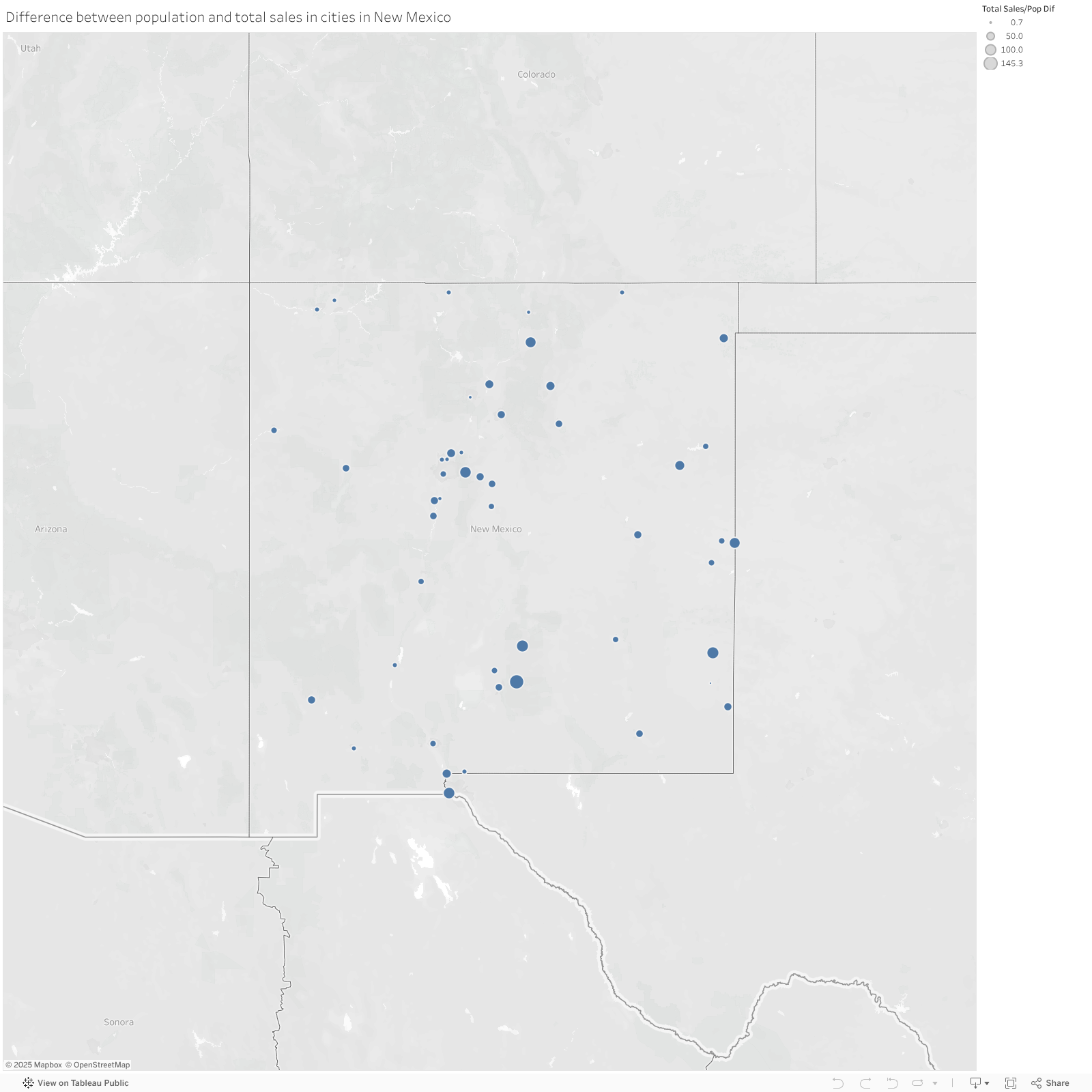
The second chart shows the difference between medical and recreational sales. This is where the border towns come to life.
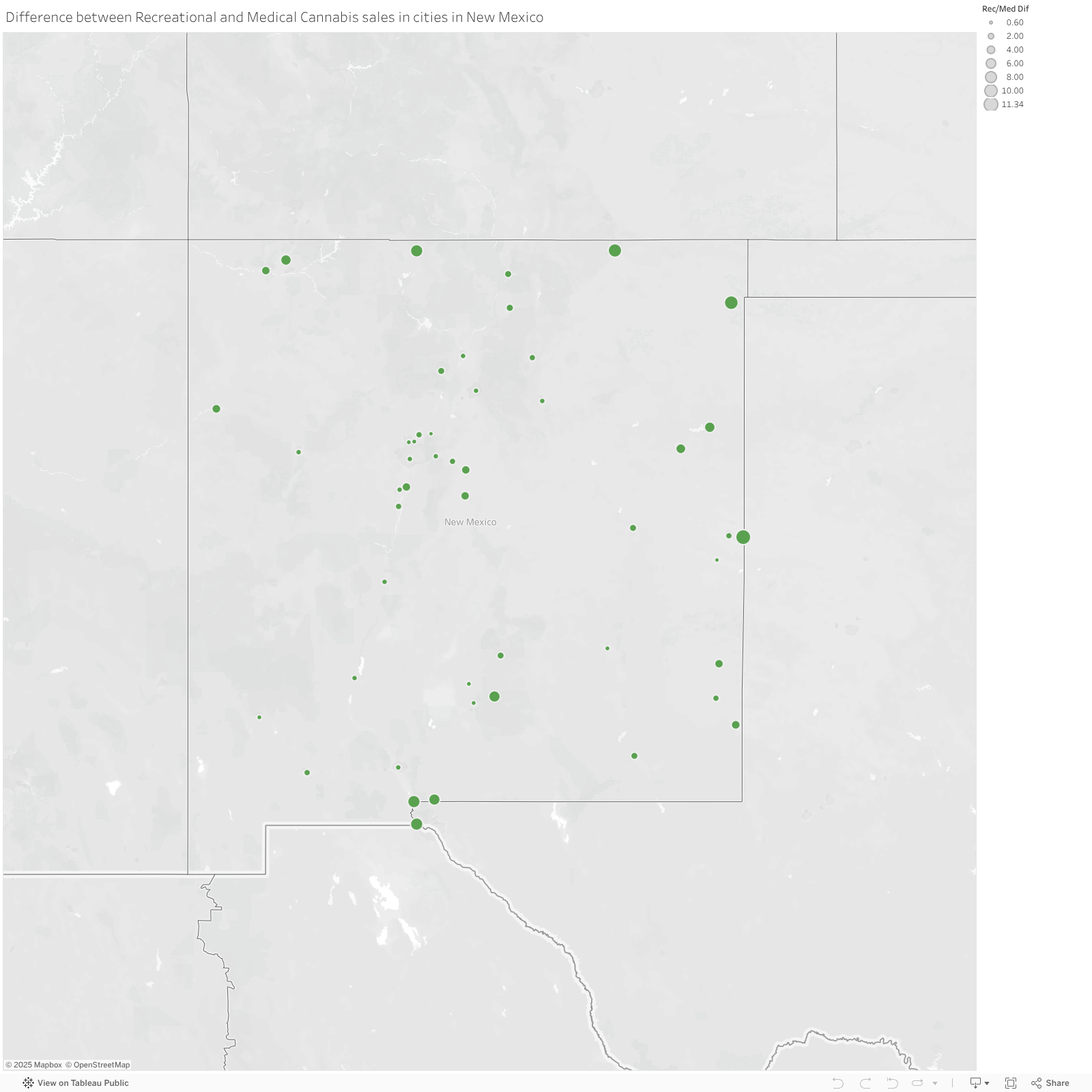
We see large circles all along the border, while the circles shrink the further into the state you head. These towns along the border exhibit much higher levels of recreational sales than medicinal sales.
What’s Next
This project was just a starting off point for my New Mexico cannabis analysis. Going forward I would like to take a closer look at distance from New Mexico cities to non-legalized state lines (namely Texas) to better plot that data.
I would also like to gather the number of cannabis retailers in each city, so that we can get a better idea of competition. This would give us a better idea of what areas could be the best to open dispensaries in.
I would also somehow like to take a closer look at product data, what people tend to buy where.
Then, just out of curiosity, I’d like to take a look at crime data – just to see if there is any correlation between legalization/number of sales and crime rates.
Summary
- Analysis of cannabis sales data in New Mexico using publicly available data realeased by the state’s Cannabis Control Division.
- Used census data to determine population of individual cities.
- Using Google BigQuery created a table containing all of the data, showcasing ability to create datasets from scratch.
- Using Google BigQuery manipulated data within tables and joined two tables together.
- Manipulated data in Google Sheets to highlight population compared to sales figures, indicating how weed tourism could be impacting New Mexico’s cannabis industry.
- Used Tableau to create visualizations on the final analysis.